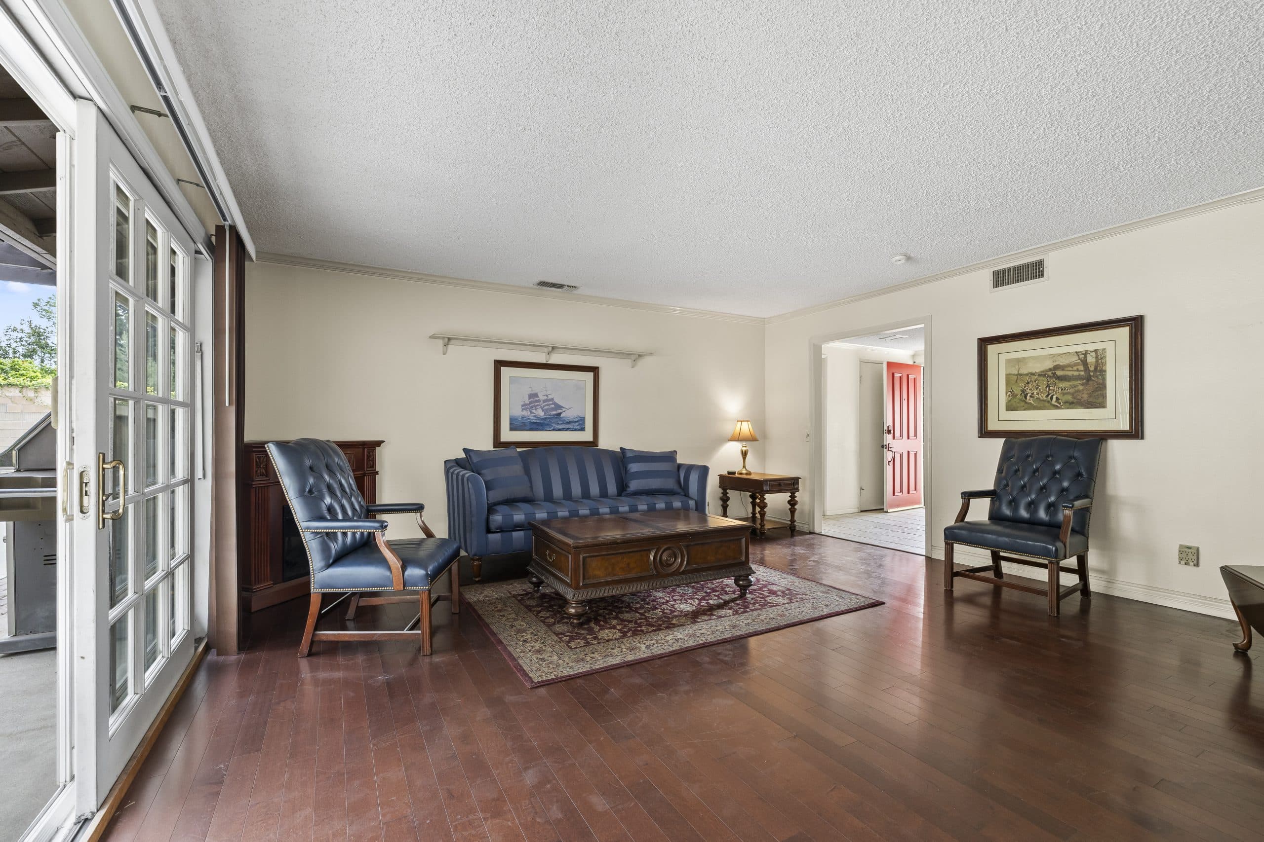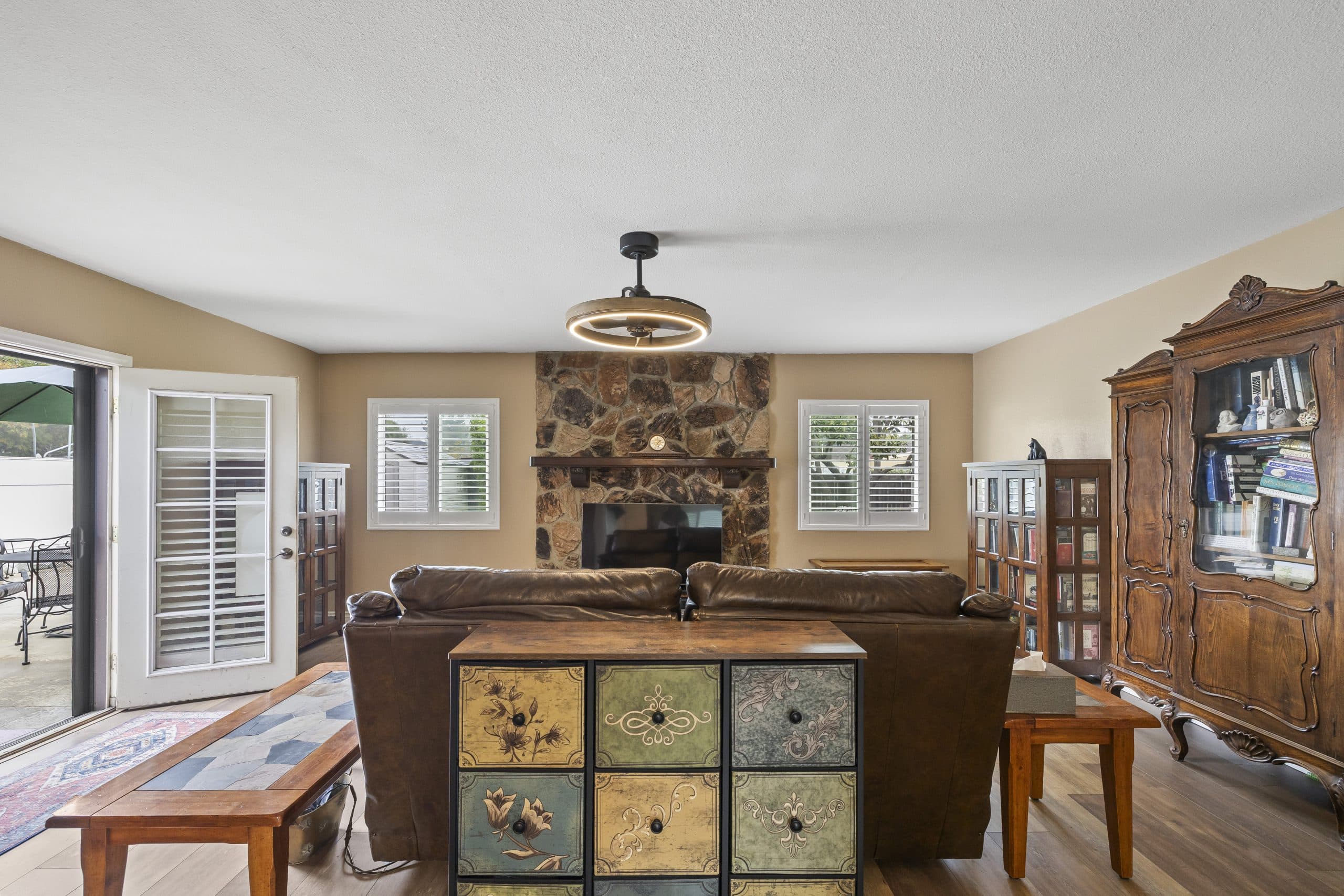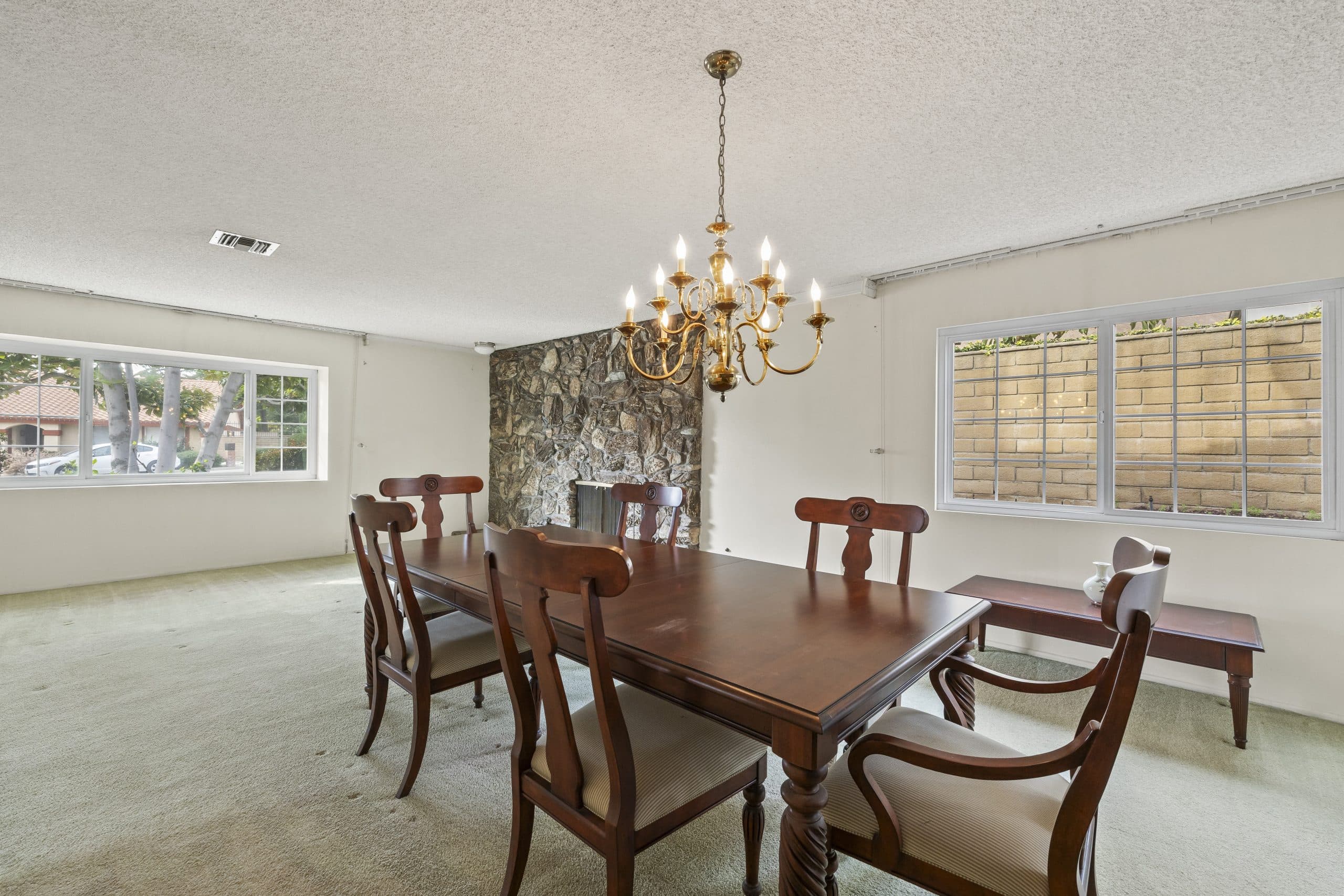
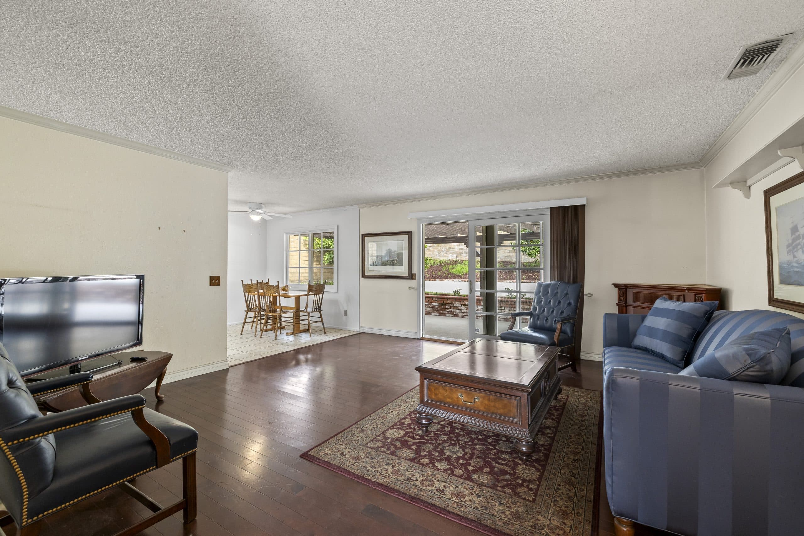
The fastest way to make a good house look wrong is to furnish it as though it were a different house. It happens constantly, and it is entirely avoidable, because every era's architecture already tells you what belongs in it.
This is not an argument for period reproduction. Nobody has to live in a museum. It is an argument about SCALE, PROPORTION, and PALETTE - three decisions that either cooperate with the building or fight it. This deepens the architecture guide.
The three rules that outrank taste
SCALE. Furniture must be sized to the room's actual proportions, not to the showroom's. Period rooms are frequently more modest than contemporary open plans, and the current default of very large sectionals and oversized islands overwhelms them.
PROPORTION. Match the visual weight of the furniture to the visual weight of the architecture. Heavy timber and deep eaves want substantial furniture with visible structure. Light modern glazing wants furniture that sits lightly on legs rather than blocks that meet the floor.
PALETTE. Take the colors from the house itself - the wood tone, the tile, the brick, the stone - rather than from a magazine. A room whose palette is drawn from its own fireplace surround will look considered even if every piece is inexpensive.
By era, in this town's stock
CRAFTSMAN AND EARLY HOUSES. Horizontal timber, built-ins, and a warm wood palette are the given conditions, and the porch and detail guide describes the vocabulary the interior repeats. Furnish with weight and honesty: substantial pieces, visible joinery, textiles rather than gloss. Avoid high-shine finishes and very tall thin legs; both read as visiting from somewhere else. Leave the built-ins visible rather than blocking them with furniture - they are the room's argument.
SPANISH AND MEDITERRANEAN HOUSES. Thick walls, arched openings, tile, and iron. The courtyard and arcade guide covers the exterior logic; inside, the rule is fewer and heavier. These rooms take dark wood, textured plaster, iron and leather, and they punish clutter. The floors are frequently the best thing in the room and should be allowed to show.
THE RANCH. Long, low, informal, organized for family life rather than ceremony, as the ranch guide sets out. Furnish horizontally: low profiles, long lines, casual materials. The mistake here is formality - a stiff dining set in a ranch reads like a costume. The other mistake is ignoring the slider to the rear yard, which is the room's real feature.
MID-CENTURY DESIGN HOUSES. Glass, structure, and the outside as part of the room, which the mid-century guide covers in depth. Keep sightlines to the glazing clear, favor pieces on legs so the floor plane reads continuously, and resist filling the volume. Emptiness is a feature in these houses, not a gap in the budget.
Staging a house for sale, specifically
Selling changes the goal from comfort to legibility. The buyer has to understand the house in about eight minutes, and furniture either helps or obstructs that.
Keep circulation clear so people walk the plan the way it was designed to be walked. Give each room ONE obvious function - ambiguous rooms read as wasted square footage. Point the eye at what the house does best: the fireplace, the view, the glazing, the beamed ceiling. And take out anything that competes with the architecture, which usually means a third of what is currently in the room.
The mistake most often made is staging to the current trend rather than to the house. A period house staged in a generic contemporary palette reads as neither one thing nor the other, and the buyers who came specifically for the character do not find it.
Light and the evening test
Furnishing decisions are usually made in daylight and lived with at night. Older houses in particular were designed around lamp light, not ceiling grids, and a room lit only from above will look flat in every photograph and colder in person.
Use layered light - table lamps, floor lamps, wall fixtures - matched to the era's own logic. It is inexpensive, it flatters period surfaces, and it changes how a house shows more than another piece of furniture would.
What to do with a house that has already been furnished wrong
Very little needs buying. Start by SUBTRACTING: take out the pieces that fight the scale, and the room usually improves before anything arrives to replace them. Then move what remains to respect the architecture rather than the television - off the built-ins, clear of the glazing, aligned with the room rather than floating in it.
Only then buy, and buy the one piece that anchors the room. A single correctly scaled sofa, table, or rug in a room otherwise honest will do more than four purchases chasing a look.
The underlying point
A house furnished to its own era feels COHERENT, and coherence is the quality people describe as charm without being able to name it. It costs nothing extra. It requires only the discipline to ask what the building already is before deciding what to put in it.
For what the architecture is telling you in the first place, read reading a Claremont streetscape. This is general information about design; furnishing and staging decisions for a specific sale should be made with the professionals involved in it.
Anthony Grynchal has been licensed in California since November 2009.
Frequently asked questions
Should furniture match a home's architectural style exactly?
No. Period reproduction is not required. What matters is scale sized to the actual room, visual weight matched to the architecture, and a palette drawn from the house's own materials such as its wood tone, tile, brick, or stone.
How should a Craftsman home be furnished?
With weight and honesty: substantial pieces, visible joinery, warm wood tones, and textiles rather than high-gloss finishes. Leave the built-in cabinetry visible rather than blocking it, since the built-ins are usually the room's strongest feature.
What is the most common staging mistake in a period home?
Staging to the current trend rather than to the architecture. A period house furnished in a generic contemporary palette reads as neither, and the buyers who came specifically for the character cannot find it in the room.
Does lighting matter as much as furniture?
Often more. Older houses were designed around lamp light rather than ceiling grids, so a room lit only from above photographs flat and feels colder in person. Layered table, floor, and wall lighting flatters period surfaces at low cost.

Written by
Anthony Grynchal
Anthony Grynchal is a California real estate professional with eXp Realty, licensed since November 2009 (California DRE# 01873626), and the Designated Local Expert™ for Claremont — where he has lived for more than 33 years.
More about AnthonyPublished · Updated