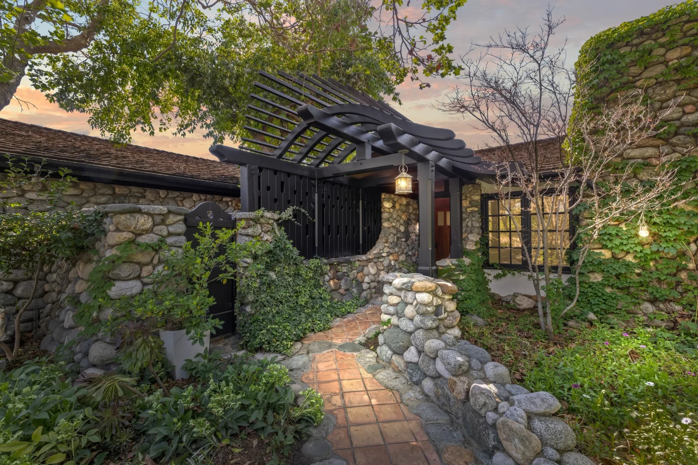
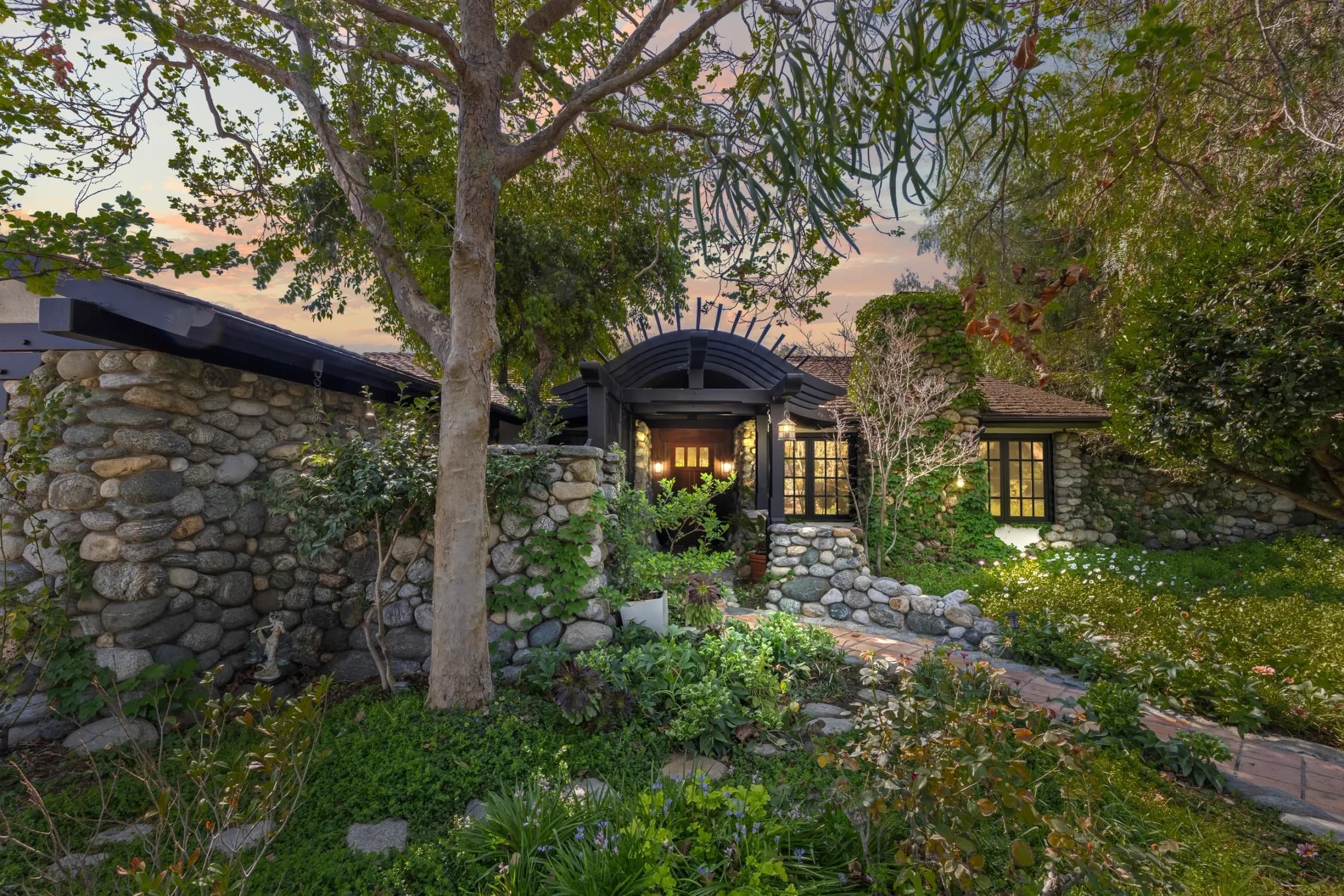
Paint is the highest-leverage decision an owner makes, because it costs the least and changes the most. It is also the decision most often made from a phone screen in a store, which is why so many otherwise good houses read as slightly off. Colour is not decoration on a house — it either explains the architecture or fights it. This extends the exterior reading in the architecture guide.
The light here is the first fact
Before any colour question, the light. This is a place of strong sun, high contrast, and long dry seasons, and that does specific things to paint.
Strong sun BLEACHES colour toward white and makes everything read one or two steps lighter than the chip. A colour chosen indoors will almost always land paler and flatter than expected on a sunlit wall. Meanwhile the same sun deepens shadows under eaves, so the shaded parts of a facade go much darker than the lit parts. A house here is never one colour; it is a lit half and a shaded half.
Practical consequence: test colours OUTDOORS, on the actual wall, in a large patch, and look at them in the morning, at midday, and at dusk. A small chip held up at noon is not a test.
Three colours, not one
Almost every well-painted house uses three roles, and confusion between them causes most bad outcomes.
The BODY is the wall — the largest area and the quietest colour. The TRIM is the frame around openings, the fascia, and the edges — usually lighter or darker than the body, and consistent everywhere. The ACCENT is the front door and sometimes shutters or a gate — the only place a strong colour belongs.
The most common error is treating trim as an accent, painting every window frame a saturated colour, which turns the facade into a grid of stripes and destroys the calm the composition depends on.
Choose by era, not by trend
Different eras want different things, and the house will tell you which if you look at its materials.
The CRAFT-ERA stock — the houses read closely in the Craftsman porch guide — was built to show structure and material. It suits deeper, earthier, more saturated bodies with contrasting trim that picks out the visible framing: rafter tails, brackets, beams, porch posts. Painting all that structure the same colour as the wall makes the house's best feature vanish.
The MEDITERRANEAN and revival stock is a different logic entirely. Those walls want to read as plaster mass, which means light, warm, low-chroma bodies and very little contrast, with the interest coming from tile, ironwork, and shadow rather than from paint. The vocabulary is in the Mediterranean details guide. Painting one of these in a high-contrast two-tone scheme immediately makes it look like a different, cheaper building.
The POSTWAR and design-era houses want the eye to travel horizontally. That favours a restrained body with trim close in value, letting the long lines and the glass do the work, as described in the mid-century guide. Wood left natural, or a stain rather than a paint, is often more correct than any colour.
What not to paint
This may be the most valuable paragraph here. Some materials should stay unpainted, and painting them is effectively irreversible.
Face BRICK and STONE, once painted, are extremely difficult and expensive to return. Beyond appearance, coating masonry changes how the wall handles moisture, which is a technical question for a qualified contractor rather than a taste question. Original interior WOOD — trim, doors, built-ins — is in the same category: painting is a Saturday, stripping is a season. The material honesty behind all of this is the subject of the materials guide.
How to find the colour the house already knows
Two cheap investigations.
First, look in the protected places: under an eave, behind a downspout, inside a porch beam junction, in the back of a closet. Old paint layers survive where sun and weather do not reach, and scraping a small area gently reveals the sequence.
Second, look at what is NOT paint. Roof colour, brick or stone tone, tile, and the natural colour of any exposed wood are all fixed. A body colour that fights the roof is a losing argument, because the roof is not changing this decade. Choosing a body that sits in the same warm or cool family as the fixed materials solves half the problem before you open a fan deck.
Where the door earns its keep
The front door is the one place to be brave. It is small, it is the focus of the entry sequence described in the entry sequence guide, and it is repaintable in an afternoon.
The only rule is that the accent should have a reason to exist: pick it up from something already on the house — the tile, a brick tone, the planting — rather than from an unrelated palette. A door colour that echoes something else on the property reads as designed. One that comes from nowhere reads as a whim.
Sheen matters more than people think
On a sunlit wall, sheen is a colour decision. Flat and matte finishes absorb light, hide surface irregularity, and let a stucco or plaster wall read as mass, which is usually what older walls want. Higher sheens reflect, showing every ripple and repair, and they make a wall read as a manufactured surface.
The conventional split — quieter sheen on the body, more durable and slightly higher sheen on trim and doors where hands and weather hit — works because it matches durability to exposure. Specific product and preparation questions belong with a painting contractor, particularly on older houses, where surface preparation and any coatings already present should be assessed by qualified professionals before anyone starts sanding.
The neighbourhood test
Walk the block before you commit. Not to copy — a street of identical colours is dull — but to see the range the block already holds and where your house would sit in it.
A house that is one step bolder than its neighbours reads as confident. One that is four steps bolder reads as a statement about the neighbours, which is a different project. The block-reading method is in the streetscape guide. And if the property carries any historic designation or sits within an area subject to design review, colour may be a regulated matter, which is a question for the city and Claremont Heritage before the ladder comes out.
The buyer's angle
A bad colour scheme is the cheapest problem in real estate, and it frequently makes a good house sit unsold. If you can see past it, that is genuine value. Look at the house's bones — massing, roof, openings, materials — and imagine it in the family of colours its era wants.
For the wider method start at the architecture guide, and read the boundary treatments that frame the whole picture in the edge design guide. Anthony Grynchal has been licensed in California since November 2009.
Frequently asked questions
Why do paint colours look different once they are on the wall?
Strong sun bleaches colour toward white, so a chosen colour typically lands one or two steps lighter and flatter than the chip suggested. The same sun deepens shadow under eaves, so a facade is never one colour. Test large patches on the actual wall and look at them morning, midday, and dusk.
How many colours should an exterior scheme use?
Three roles: a quiet body colour for the walls, a consistent trim colour for frames, fascia, and edges, and one accent reserved for the front door. The common error is treating trim as an accent, which turns a facade into a grid of stripes and destroys the composure the composition depends on.
Should I paint brick or stone?
Generally no. Painting masonry is effectively irreversible — removal is difficult and expensive — and coating a masonry wall changes how it handles moisture, which is a technical question for a qualified contractor rather than a matter of taste. The same reversibility logic applies to original interior wood.
How do I find a colour that suits my house?
Start from what cannot change: the roof, any brick, stone, or tile, and exposed natural wood. Choose a body colour in the same warm or cool family as those fixed materials. Then check protected spots under eaves or behind downspouts, where original paint layers often survive intact.

Written by
Anthony Grynchal
Anthony Grynchal is a California real estate professional with eXp Realty, licensed since November 2009 (California DRE# 01873626), and the Designated Local Expert™ for Claremont — where he has lived for more than 33 years.
More about AnthonyPublished · Updated